Most parish bulletins are ugly.
This has been obvious for some time: In 2015, Catholic Creatives, an online community of artists and entrepreneurs, met specifically to diagnose the issue of important information getting lost in bad bulletin design.
A parish bulletin redesign does not have to be a daunting task.
I combed through dozens of parish bulletins from around the country and noticed a similar set of design issues. Most of them just need to be simplified.
These 10 considerations can help create a bulletin people will actually read.
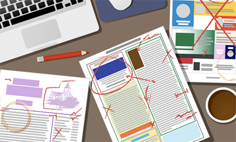
Make sure your bulletin is legible
Most of the bulletins I have seen are simply too difficult to read. Text is disorganized, content is packed too tightly, and important information is easily lost.
You should not expect readers to work hard to access the bulletin’s information. Consider asking a few trusted people: “Is this clear? Can you read this easily?”
Keep things organized
Reading a parish bulletin can feel like opening someone’s junk drawer.
You have to sift through the pastor’s letter, the announcement about the clothing drive and even the odd quotation from St. Augustine before finding the schedule for Mass.
Think of visual organization like sorting items into boxes based on their function. For example, all parish announcements should be grouped together, Mass and confession times should be together, and recurring features like the parish directory should be found in the same place every week.
But resist the temptation to use actual boxes with hard borders in your design. Even worse are “fun” borders.
A concert announcement does not need to be in a box with a border of musical notes. This kind of embellishment is tacky, unprofessional and outdated.
Consistency is your friend
Designers at publications like National Geographic, The New York Times and America spend a lot of energy on eye-catching covers and inside pages. But they know readers come to expect certain elements, whether it’s National Geographic’s signature yellow border or the publication name on the cover of America.
The same can be said of parish bulletins.
If it seems as if you are designing from scratch every week, readers will sense it.
Save yourself time and keep elements like font and colour scheme consistent.
If your parish has a logo, keep using that. The same rule applies inside: Each page should feel like a part of the same bulletin.
Strive for simplicity
So many bulletins are overcrowded. Not only is there too much information on any given page, but unnecessary elements make the bulletin harder to read.
I already mentioned “fun” borders, and no one needs a clip-art photo of a loaf of bread to know about next month’s bake sale.
The project of decluttering should affect every single aspect of the bulletin design. It starts with getting rid of “https://www” before every website address.
Consider moving that list of parish committee members from the bulletin to the parish website. And do not cram the parish directory, the pastor’s letter and weekend Mass times on the cover along with a large illustration for that week’s Gospel reading.
Establish a hierarchy
Hierarchy in design has less to do with popes and bishops and more to do with clearly communicating what a reader should see first, second, third, etc.
It allows the reader to move through the bulletin without getting confused or overlooking key information. For example, Mass times should appear higher in the bulletin’s hierarchy than the parish directory.
You can establish a hierarchy by changing an element’s size, placement on the page and colour. Readers are drawn to bigger items first and tend to read from the left side of the page to the right. Be aware of this when putting together each page. Continue reading
Additional readingNews category: Analysis and Comment.